Trekmate
End-to-End Web Design
Designed as an early project for DesignLab
Focus: Trip Planning
Device: Optimized for Mobile
Introduction
The aftermath of the pandemic left more and more people seeking outdoor activities in hiking. Many first-time hikers found themselves lacking comprehensive, quality resources and software for planning trips, especially when they involved multiple participants. In interviewing hiking hobbyists, I discovered that a very common problem is the difficulty coordinating efficiently and accurately with other members of the hiking group, which leads to a lack of confidence leading up to the trip and discomfort on the trails.
I decided to create Trekmate, an online hub for groups of people planning hiking trips. This hub allows members of a group to easily view and share details about their trip and the planned route. Team members can plan collaboratively by editing and adding to a shared packing list and itinerary. Trekmate helps users to feel informed about their trip and the preparation process.
I identified three user personas who would benefit from this hub:
The Organizer: The organizer is motivated by challenge. They hike with a specific destination in mind. They like to track the stats of their hikes. They are easily frustrated by a lack of preparation from others in their group and by a lack of access to accurate, updated information.
The Explorer: The explorer’s primary motivation is discovery. They hike to escape from civilization and experience new things. They struggle with advanced preparation, so they often find themselves unprepared on the trail.
The Socialite: The socialite is motivated by the group bonding experience and by being active with other people. They don’t know as much about hiking and worry about their lack of experience and about holding back the group.
Research
When entering the main research phase of my project, I had the following goals in mind:
To determine a hiker’s main considerations when selecting and planning for a trail route
To understand hikers’ motivations for the activity and for seeking out one trail over another
To understand the limitations to a hiker’s enjoyment of or ability to use a trail
To identify gaps in current planning capabilities
I did a competitive analysis of six apps/websites- two of them local and the other four more universal- to get a sense of the branding, the design patterns, what is currently available to users, and what is currently lacking. This analysis led me to three main insights:
Pricepoint: It is hard for users to afford many of the resources currently available. Trekmate should offer a tiered plan and a free trial so that users can become comfortable with it.
Map Functionality: Users comment on a lack of search function and limited use of filters and overlays. Trekmate should consider partnering with a robust and frequently updated mapping software.
Accessibility: Not a main concern and often not addressed at all on available resources. Trekmate should make this a focus in the UI design and by providing info. on each trail's accessibility.
I conducted remote user interviews with five hiking hobbyists in my target age group of 25-34 (this is the most common demographic for traffic on comparable apps and websites). All participants were residents of St. Paul or Minneapolis, Minnesota, but had varying levels of experience with planning hiking trips.
All interviewed users were asked to describe their experience with hiking and planning trips. They were asked about their preferences- their methods for selecting a trail and what about the planning is challenging. I asked about their typical planning procedure, including the time spent on the planning phase and some good and bad experiences they’ve had, both planning and on the trails.
I found that hikers normally plan trips for 3-5 people; they tend to go with their families or with small groups of friends. 80% of the users I interviewed said they feel uncomfortable with their experience planning trips. 100% of them said that they feel the current technology available for planning hiking trips is hard to use or inadequate.
Definition
As a result of the interviews, I identified the following common problems:
Group Communication: It’s hard for the main planner of the group to identify the group’s comfort and readiness levels.
Accessibility Communications: It’s often hard to tell a trail’s limitations or ease of access until one is on the trail.
Day-of Considerations: Important information, such as water level and humidity, are often overlooked.
Local Points of Interest: Information on local landmarks and scenic views would be appreciated, and is often lacking on online resources.
Some other interview insights included:
Foot traffic on trails is an important factor to multiple users and is reportedly hard to track.
Proximity to nature and finding a getaway from civilization are common motivators.
Planning levels vary from months in advance to none at all.
Planning for groups with different personalities is a common pain point.
Both constant and day-of conditions need to be considered before going on the hike.
After the interviews, I did some affinity mapping, using key insights, points, and quotes from the interviews. This helped me get a sense for the commonalities and differences between the interviewees- common motivations for hiking and common challenges.
In planning for the organization of the hub, I utilized a card sort to help me determine the mental models at play. I determined several categories based on potential navigation headers for the website, to determine where a user might naturally expect to find a feature or piece of information. My initial categories were: Account, Settings, Conditions, Planning, Description, Social, Discovery, and Shop. Following the sort, I added a ninth category: Profile. I found a lot of commonalities between Conditions and Description and determined that Conditions could be nested under Description.
I used the card sort to create a site map. I wanted to keep this as “shallow” as possible, so that it would not take the user many clicks to get to the information or task they want to find. Each color on the site map represents a different number of button clicks to navigate from the Homepage.
Using the affinity map as a tool and looking over the insights from my interviews, I mapped the User, Business, and Tech goals for the product so that I could better prioritize what to design first and where to allocate my time to create the best MVP.
Design
Logo Drafts
In designing the logo for Trekmate, I settled on a compass. It represents the brand well through its connections with direction, exploration, and confidence. Blue represents security while orange is associated with energy. Paired, they create a vitalized and athletic tone for the brand. I chose the sans serif font, Urbanist, for the branded typeface and paired with IBM Plex Sans for the body content.
FigJam File: User and Task Flows
Before beginning my wireframing, I created a few flows to guide the structure of the UI design. I created user flows for saving a trail to the user’s favorites list, registering a new team, and updating the team packing checklist. I then broke the third user flow into a couple of task flows: New User Registration and Adding an Item to the Packing List.
Figma File: Low-Fidelity Wireframes
From these flows, I created low-fidelity wireframes to get an idea of the visual structure and hierarchy. I created a registration flow, one for the trips and one for the packing list.
My next step was to design UI components for the high-fidelity frames. The component library pictured above was edited slightly with the iterations. You’ll see in the high-fidelity frames that the buttons used to have rounded edges, for example, and these were edited to be more in line with the style and branding of the site.
Figma File: High-Fidelity Wireframes
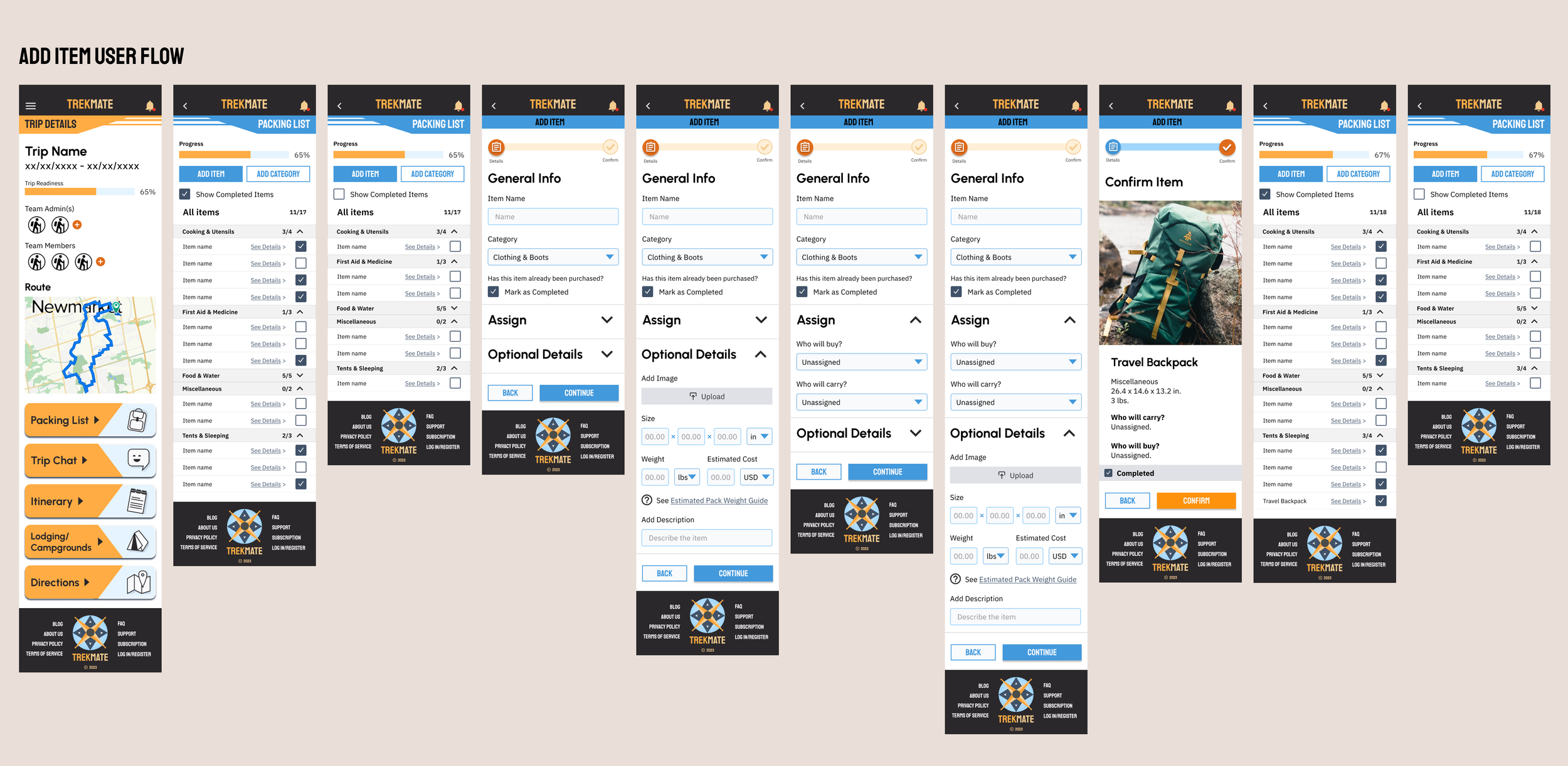
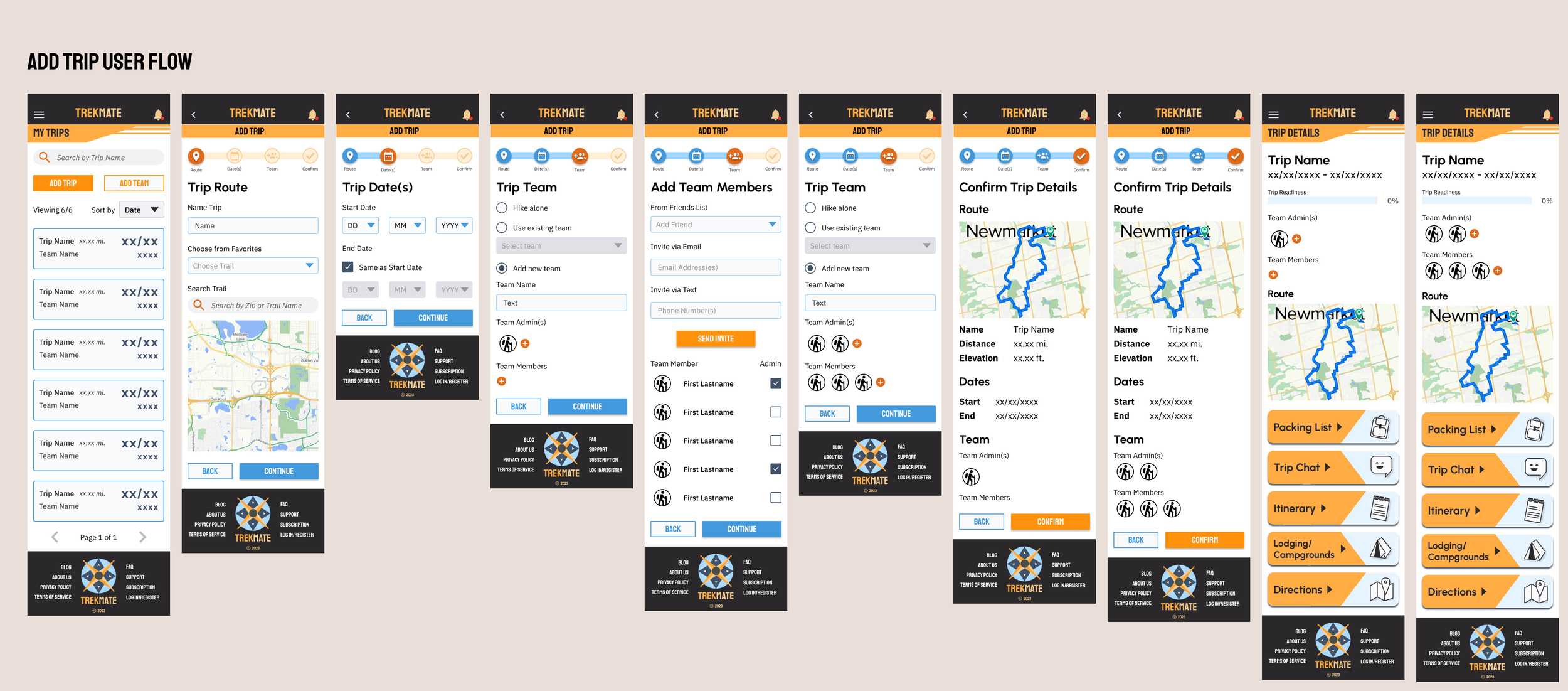
By the time I was ready to fill in the details of a high-fidelity wireframe, I was focusing on the two flows I considered most unique to this app: Adding a Trip and Adding an Item to the Packing List.
Testing
Once I created my first prototypes, I tested with six participants with varying levels of hiking ability. The participants tested two at a time, one on my phone and the other on my computer. We talked about feedback both individually and all together after the testing was done. We tested both flows.
I measured against the following success metrics:
Task Completion Goal: 83% of users or higher able to fully complete each task.
Result: All six participants were able to complete both tasks without guidance.
Efficiency Goal: Users complete Add New Trip within 15 min. and Add Item within 10.
Result: All six participants completed both tasks within the goal time.
Experience Goal: Users rate overall experience a 7 or higher on a 10-point scale.
Result: The average rating was 8.92, and all users rated between 8 and 10.
Several elements tested well:
Multiple Modes of Return: Users liked that there were multiple ways to navigate to previous pages in each flow: the progress bars, back arrow, and back button.
Administrator Control: Users liked the ability to designate multiple participants as administrators, with additional controls.
UI Retention & Limited Errors: Users commented that the progress bar and design elements similar to other booking applications reduced the risk of getting lost.
Details Summary Page: The summary page at the end of each flow was helpful to users in confirming that they had done everything correctly.
Iterations
I received many great suggestions and insights as a result of the testing as well. The main iterations I completed as a result were:
Updated the buttons to a square to better match the brand style.
Created a CTA at the top of the My Trips, Add Item, and Packing List pages for easy access.
Removed the Filter option for simplicity.
Added a display for the number of elements shown per page and number of pages.
Added an option to choose route from a list of saved Favorites on the Add Trip - Route page.
Unnested the packing list and removed the filter and search options for simplicity.
Combined the Item Details into one page for simplicity.
Added a link to a guide on Estimated Pack Weight for less experienced users.
Added a field for Estimated Cost per item.
Removed the option to add to the team on the summary pages to make them consistently uneditable.


Reflections
Designing TrekMate was an exciting opportunity to merge my passion for the outdoors with my UX learning. This project allowed me to address the challenges of creating an app that caters to both casual hikers and seasoned adventurers, ensuring the interface was intuitive while offering advanced features for more experienced users. One of the key takeaways from this project was the importance of personalization—recognizing that each user has unique preferences and needs when it comes to outdoor exploration.
The challenge of incorporating real-time environmental data and integrating multiple mapping options while keeping the design clean pushed me to think critically about how to display complex information without overwhelming the user. Continuous user testing played a pivotal role in refining these elements and ensuring that the experience was both engaging and informative.


